Client
Timeline
Services
Project Goals
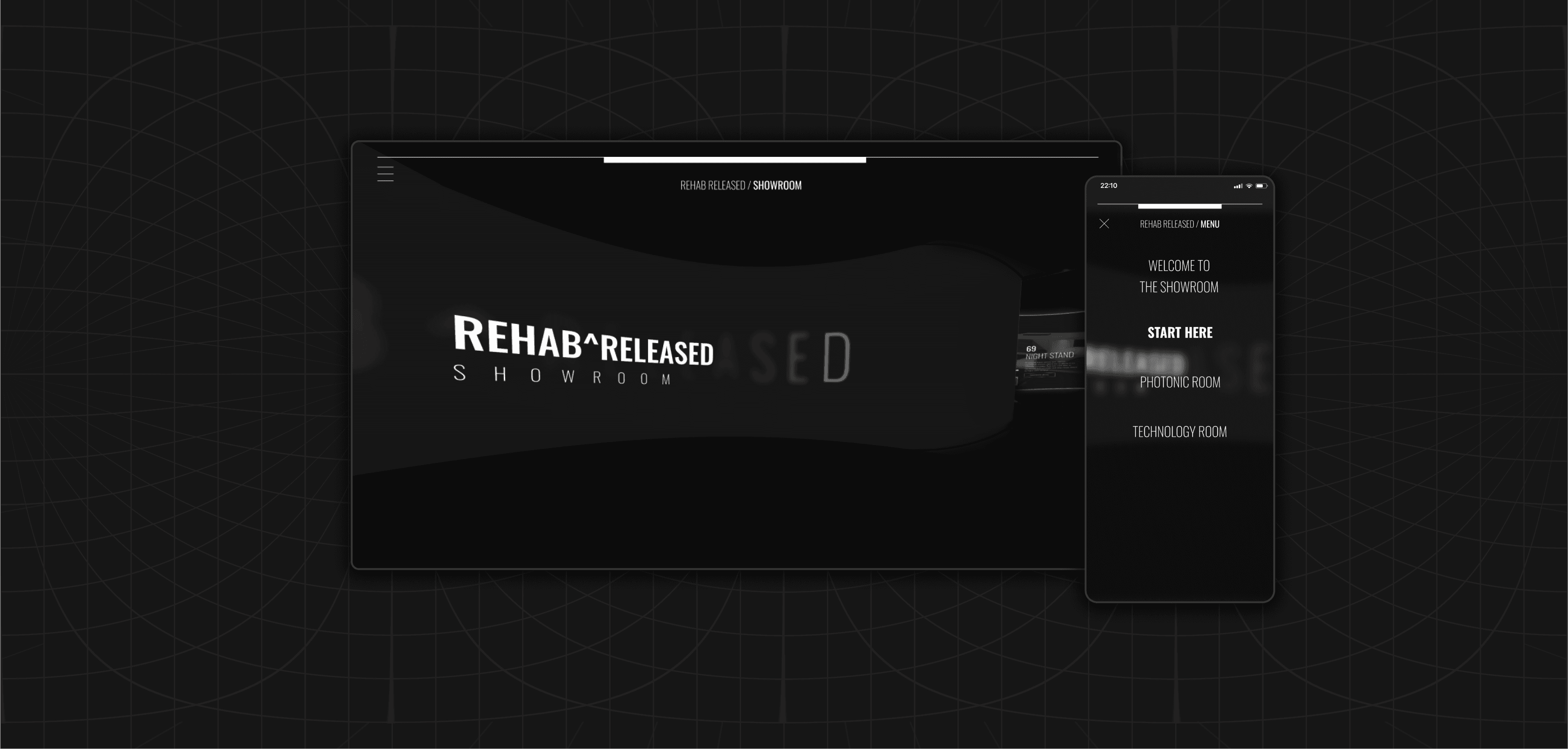
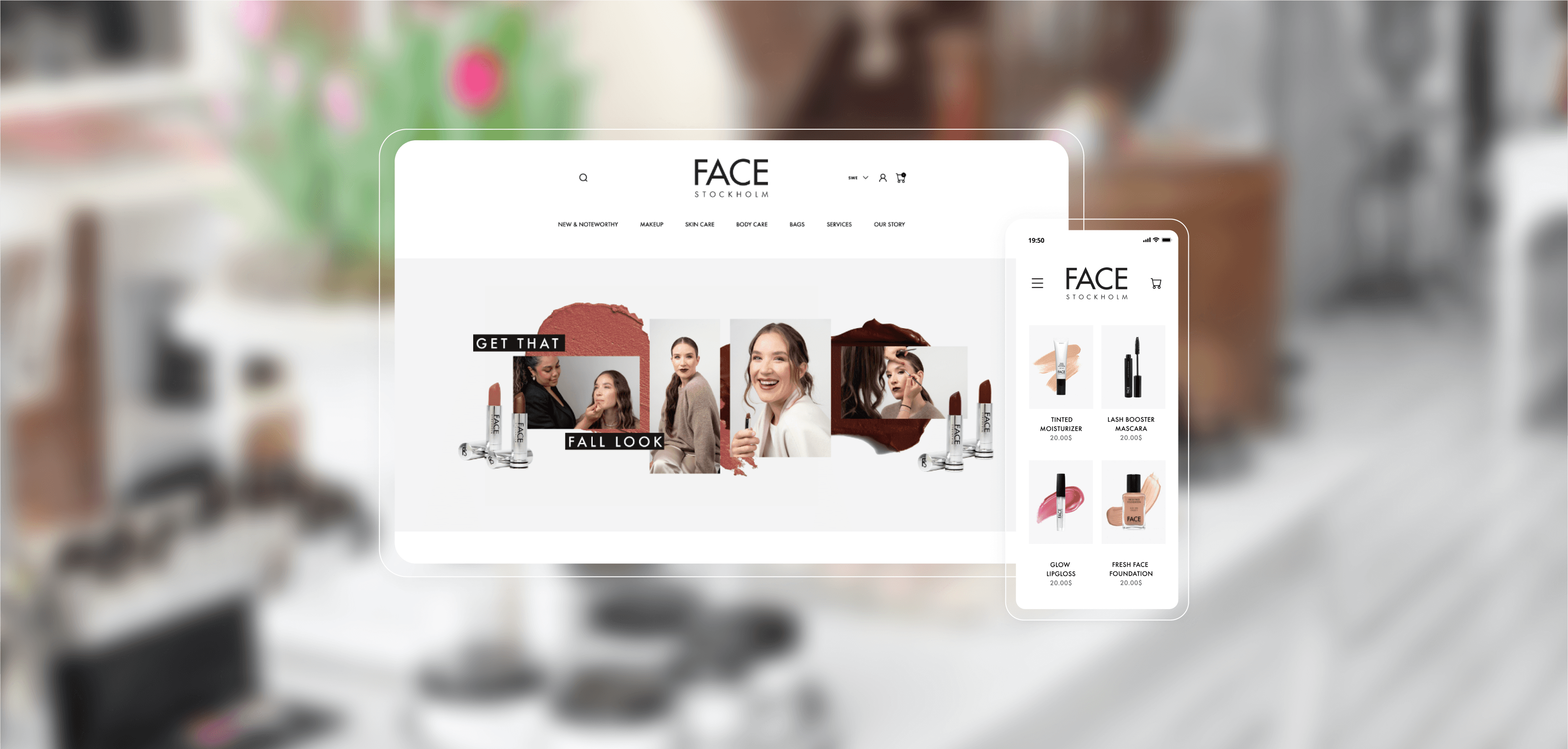
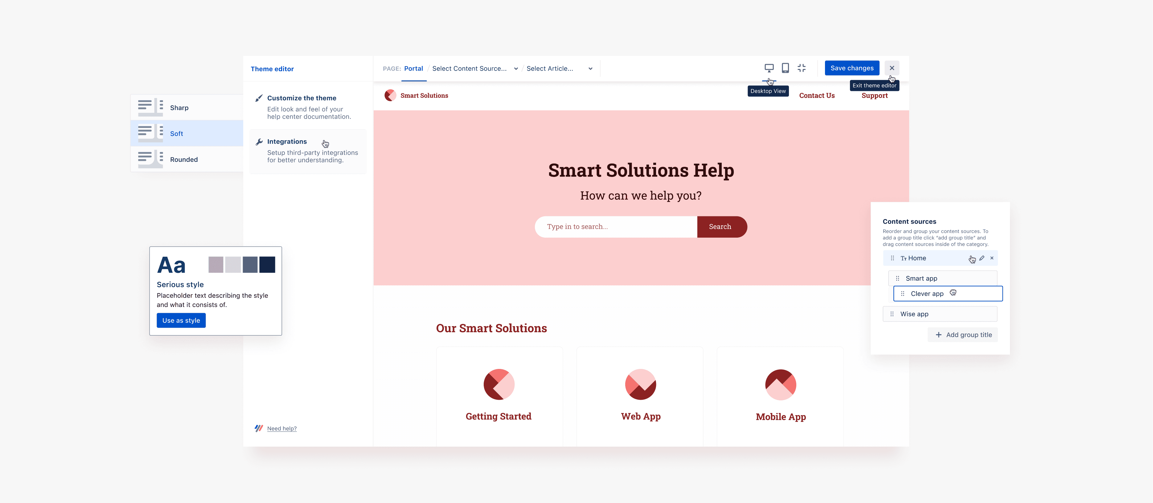
Highlighted Features
Business Results
Design Tales
Got A Similar Project?
Let's Do it together!
Book a free 15-min call to see how I can help your problems.
Book a free 15-min call to see how I can help your problems.